New Baphomet I been modernizing | Forum

Topic location: Forum home » Culture » Art
Zach Black Owner
Zach Black Jan 19 '21
This could be the new SIN logo. As you can see it is a evolution in progress. Feel free to let me know which is your favorite. :)


Dark Enlightenment
Dark Enlightenment Jan 19 '21
Beware copyright infringement. I've heard they are protective of it. 


Exclude  "Leviathan" or pick a different 5 letter word in Hebrew, and there is no intellectual property inflingement, it becomes legally distinct from "Old Bessie". If you plan on making it a logo.


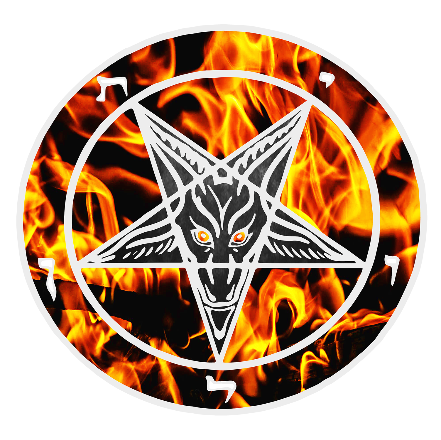
If leviathan = לִויָתָן


הא שטן = Ha Satan

ילד עז = goat kid

מחומש = pentagram 


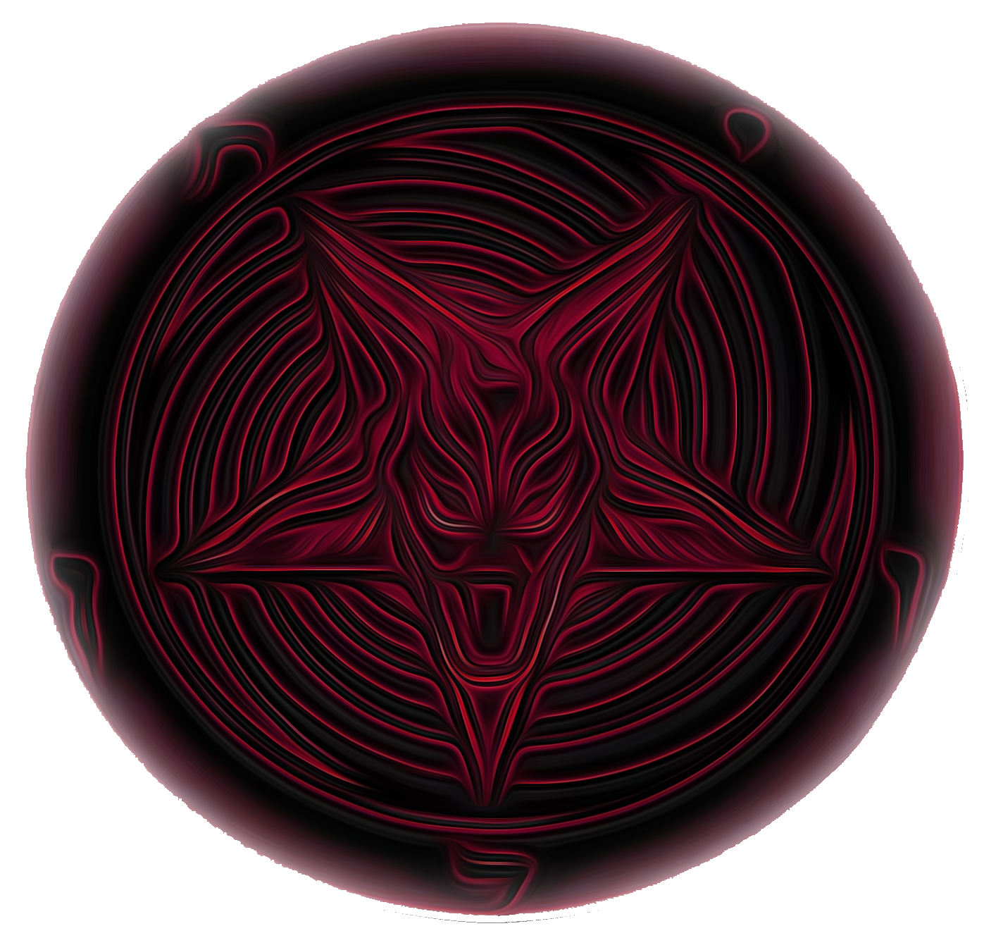
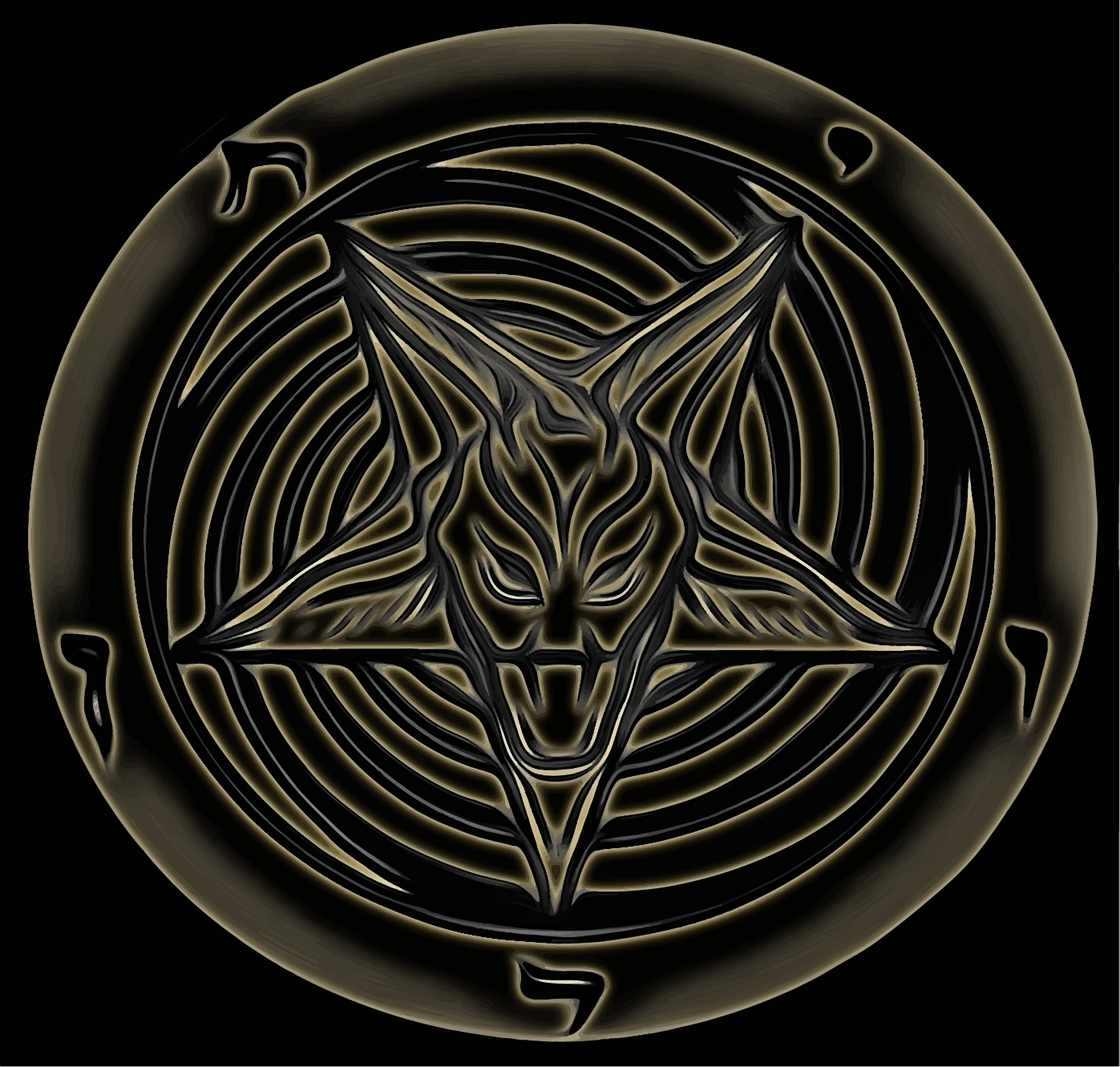
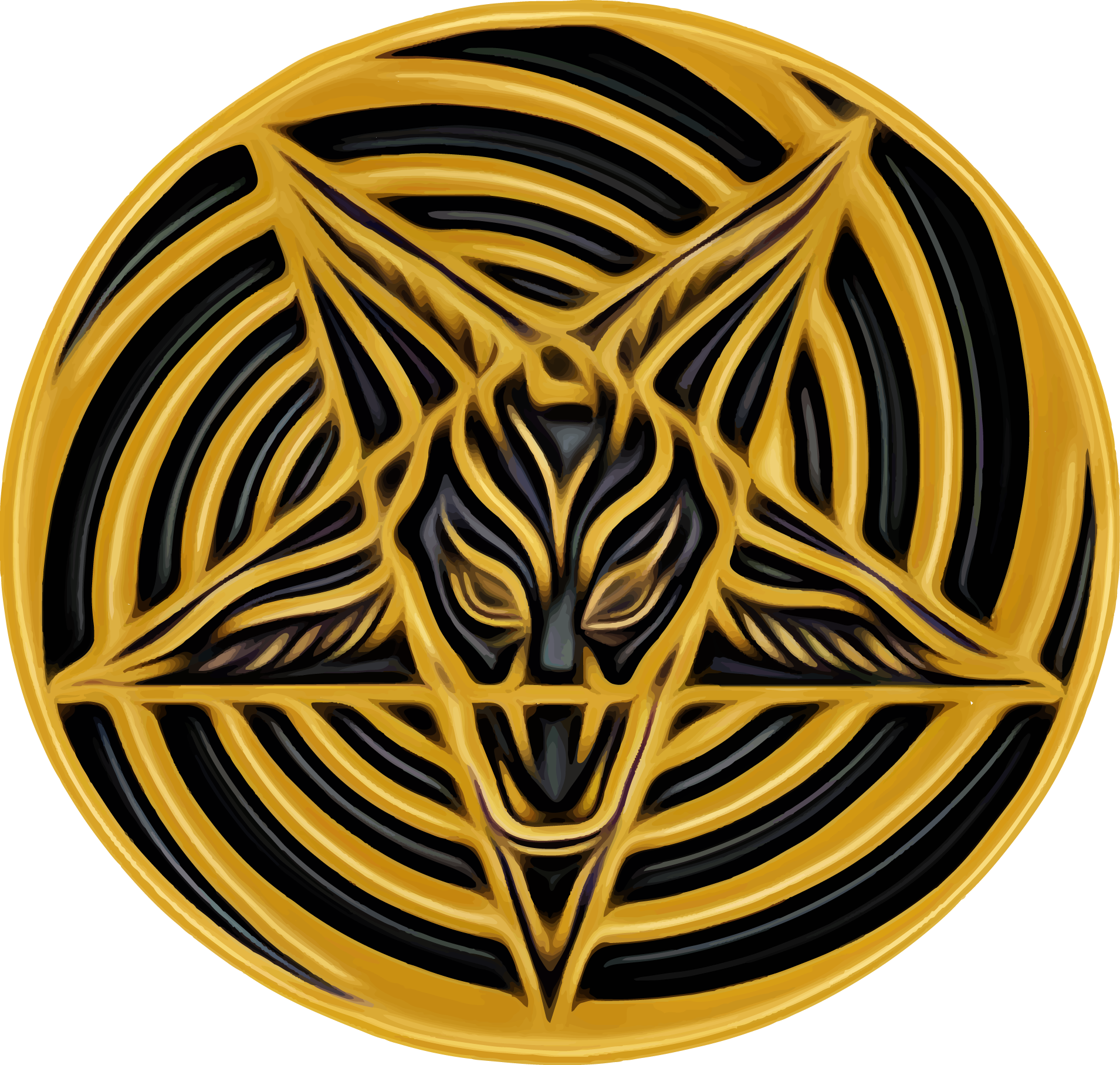
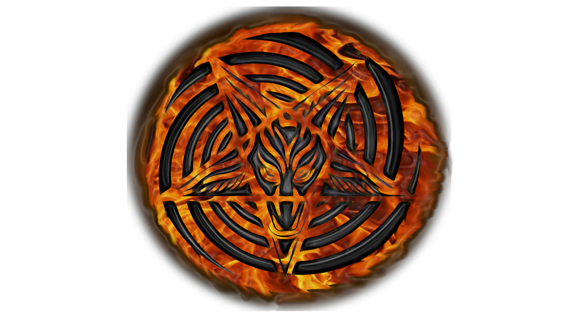
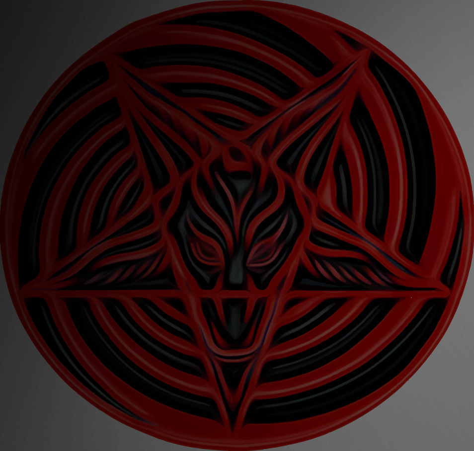
Adding the spiral as part of the design allows use of the sabbatic goat/pentagram, especially if the spiral is part of the pentagonal structure and not noticeably in the background.  There is also leeway for spoofs commercially (Like the Trump one) 


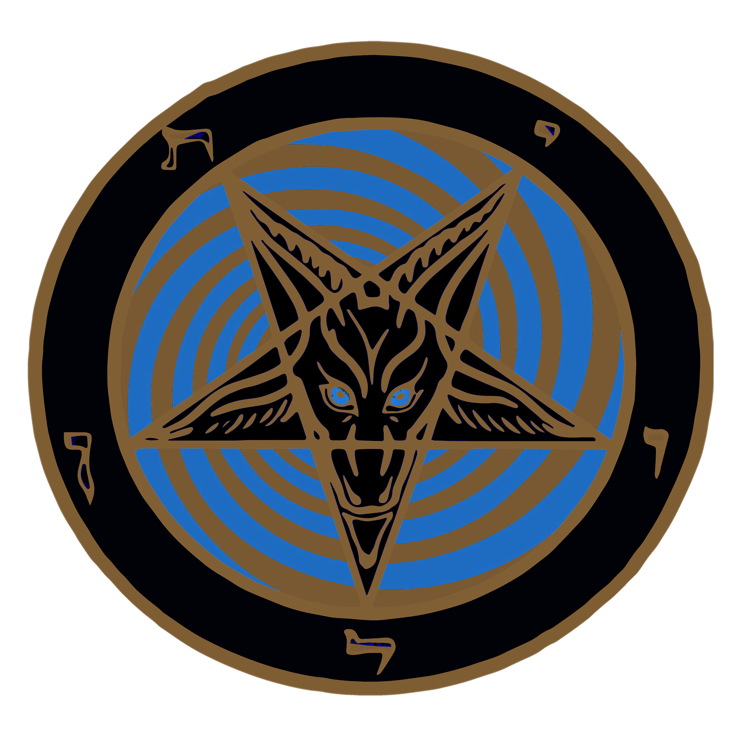
The very bottom one I would say is distinct enough.  


Unless they want to come after the contours bring identical. So like Vanila Ice changed Queen/David Bowie with one additional beat, add an interior line on the design of the goat/pentagram, change the eyes, or something different enough so if you ommercialize it no one has a claim of any of the above. 


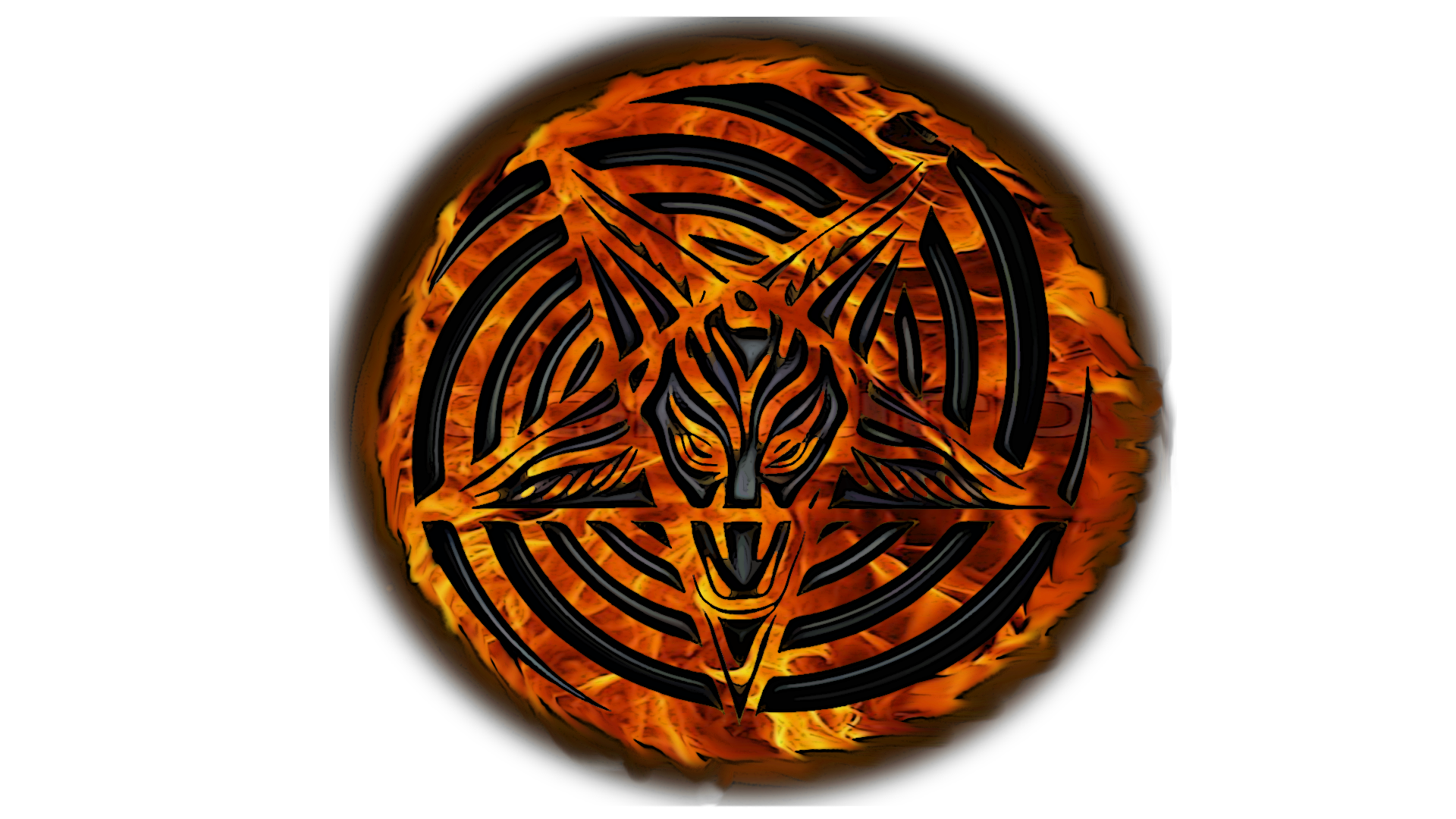
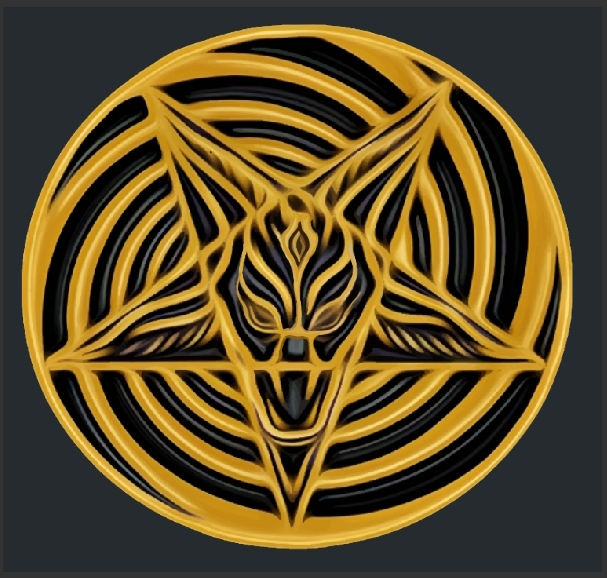
For a bad and rough example and because I'm bored.


Given the 30 hits of acid thing, and promoting psychedelics why not add a 3rd eye? LSD opens that right up.


The Forum post is edited by Dark Enlightenment Jan 19 '21
Tkwilliams Member
Tkwilliams Jan 20 '21
The red is nice, you could ditch the Hebrew all together and try younger futhark, could look fresh and confusing hahah
The Forum post is edited by Tkwilliams Jan 20 '21
Jan 21 '21
It's a hard choice. I like the red, black & gold or blue & black one with the Satanic International Network around it. 
Cornelius Coburn
Cornelius Coburn Jan 25 '21
Black and red(or crimson) is always good.
Zach Black Owner
Zach Black Jan 26 '21
i like this one


Zach Black Owner
Zach Black Jan 26 '21
vvvvv
Cornelius Coburn
Cornelius Coburn Jan 27 '21
That one looks pretty good too. I wonder how easy it is to match the rest of the site layout. I suppose you would want something that's not too hard on the eyes.
Username333
Username333 Mar 30 '21
First one looks cool. I'm very late, i know. :D
The Forum post is edited by Username333 Mar 30 '21
Wolfie
Wolfie Jun 7 '21
This is my favorite. Mainly because it isn't a reworking of the CoS logo.


Satanic International Network was created by Zach Black in 2009.
Certain features and pages can only be viewed by registered users.

Join Now

Donate - PayPal